Skip to content

Settings

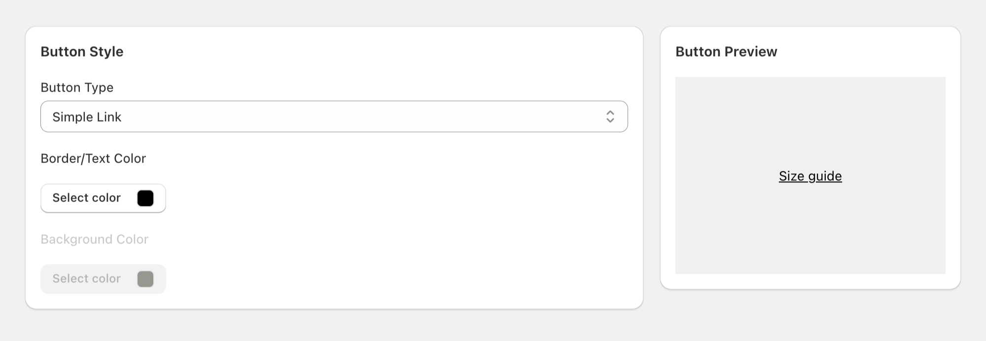
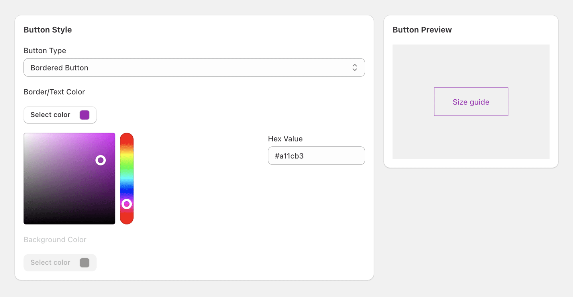
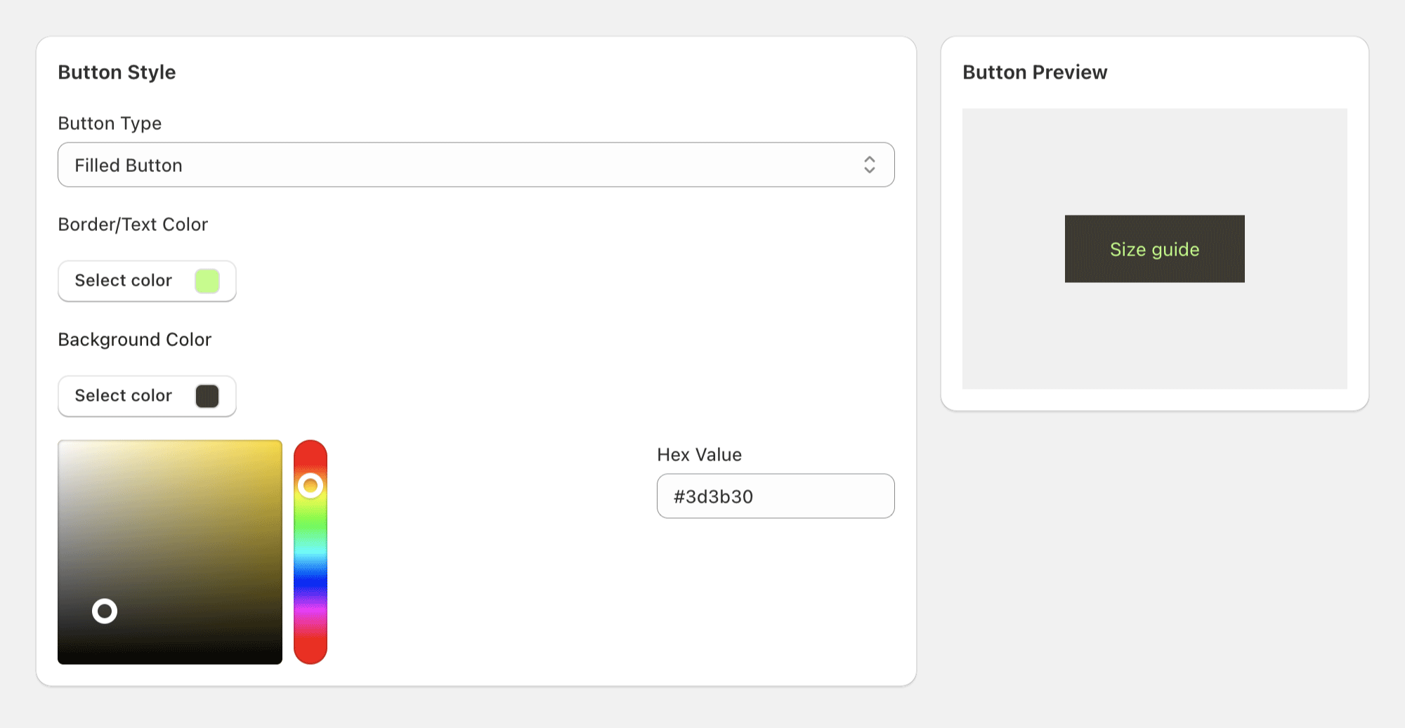
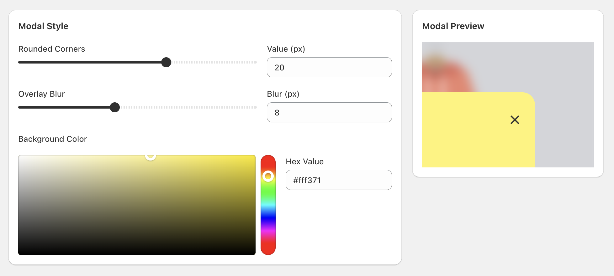
This allows you to change the styling of the Size Guide Button and the Modal for your store.

Size Guide Modal

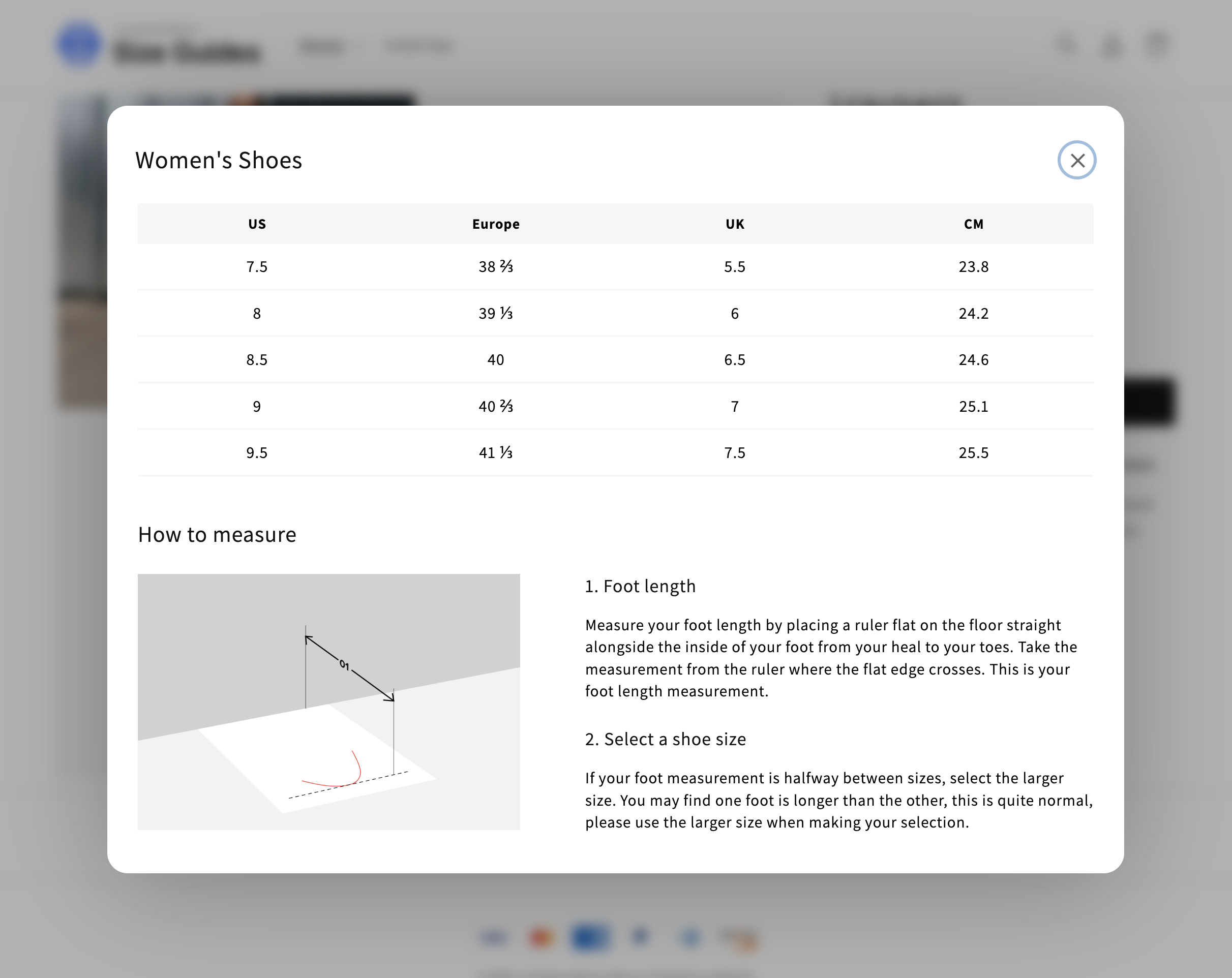
Example of a Size Guide implemented on a theme.


Size Guide Modal

Size Guide Modal

Size Guide Modal

The Size Guide Modal provides a user-friendly interface for your customers to view size information. Merchants can customize the following aspects of the modal:

  • Rounded Corners: Modify the corner radius of the modal (0-50px) to adjust the appearance that aligns with your store’s theme.
  • Overlay Blur: Control the blur effect applied to the page content behind the modal (0-20px). This creates a focused viewing experience by softening the background while keeping the size guide content sharp and readable.
  • Background Color: Choose the modal’s background color using the color picker or by entering a hex value directly.

Size Guide Modal

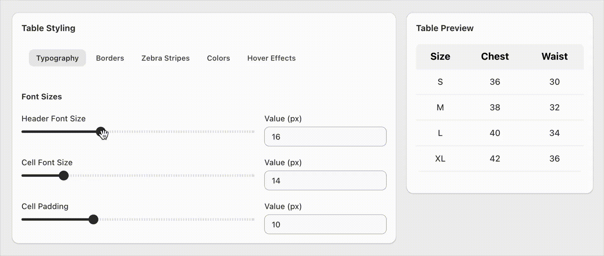
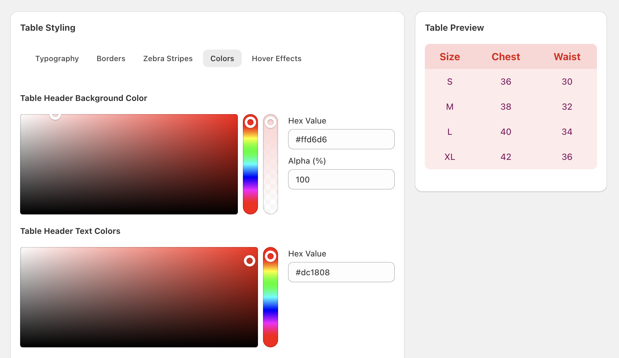
The Size Guide Table offers comprehensive customization options to match your store’s design perfectly. The table styling interface is organized into categories for easy navigation.

Control the text appearance and spacing within your size guide tables:

  • Header Font Size: Adjust the font size for table column headers (12-24px), or you can manually input custom values
  • Cell Font Size: Customize the font size for table data cells (12-24px), or you can manually input custom values
  • Cell Padding: Control the spacing inside table cells for better readability (4-24px), or you can manually input custom values

Typography Settings

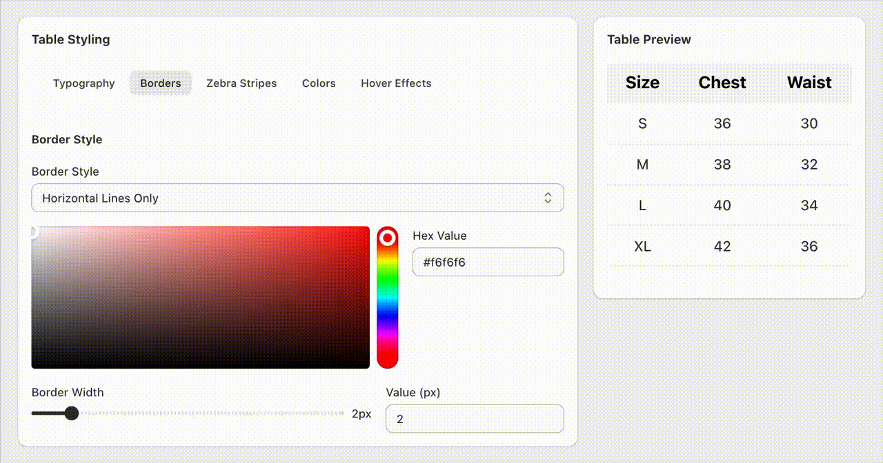
Define how table borders appear and behave:

  • Border Style Options:

    • No Border: Clean, minimal appearance without visible borders
    • Horizontal Lines Only: Traditional table rows with horizontal separation
    • Vertical Lines Only: Column-focused layout with vertical dividers
    • All Borders: Complete grid structure with full border framework
  • Border Customization:

    • Border Color: Choose any color using the color picker or hex input
    • Border Width: Adjust line thickness from 1-10px for optimal visibility

Typography Settings

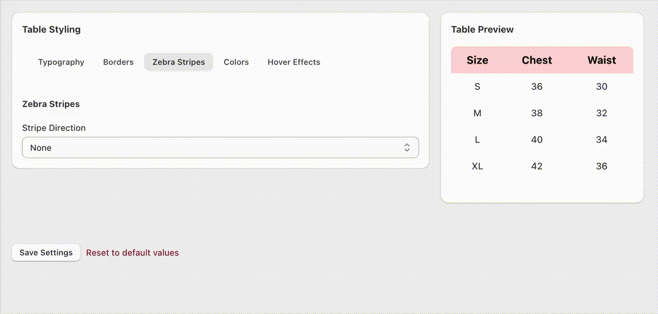
Enhance table readability with alternating background colors:

  • Stripe Direction:

    • None: Uniform background across all cells
    • Horizontal Stripes: Alternating row backgrounds for easy row scanning
    • Vertical Stripes: Alternating column backgrounds for column comparison
  • Stripe Color: Full color control with opacity adjustment for subtle or bold striping effects

Zebra Stripes Settings

Comprehensive color control for all table elements:

  • Table Header:

    • Background Color: Header section background with opacity control
    • Text Color: Header text color for optimal contrast
  • Table Cells:

    • Background Color: Cell background with transparency options
    • Text Color: Cell text color for maximum readability

Colors Settings

Interactive features that enhance user experience:

  • Selected Cell Color: Highlight color for the cell currently being hovered
  • Cross-hair Guide Color: Subtle highlighting for the entire row and column of the hovered cell, creating a visual guide effect

These hover effects work together to help customers easily track measurements across rows and columns, improving the usability of your size guides.

Colors Settings

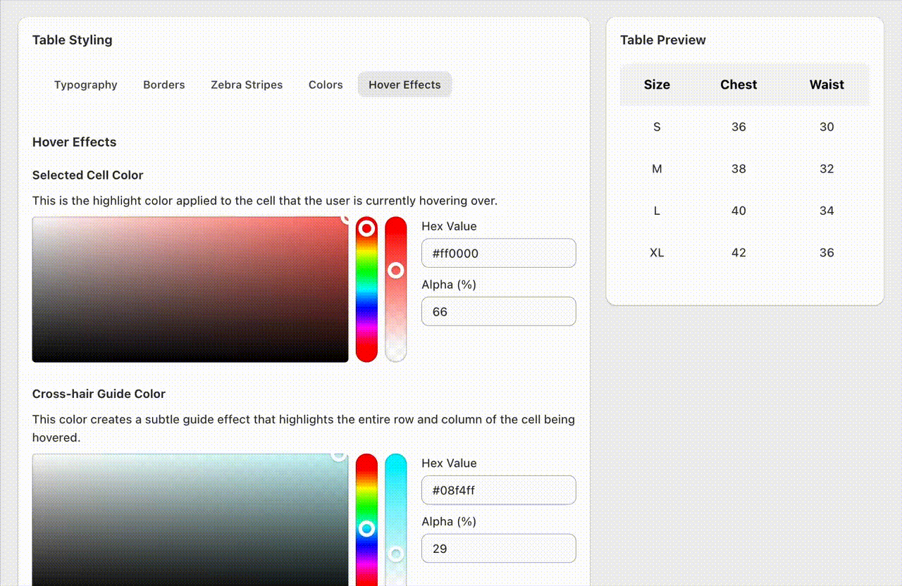
All table customizations are displayed in real-time through an interactive preview table. Hover over the preview cells to see how your color choices work together and ensure optimal visual hierarchy.

Tip: Use subtle transparency on hover effects and guide colors to maintain readability while providing helpful visual cues. The selected cell color should be more prominent than the guide color for the best user experience.